Review #1
Product: "Heat" Perfume
Target Audience: Women 18-25 (sub target; their boyfriends)
Tagline: “Catch the Fever”
Beyonce, as we all know, is a singer originally from the hip-hop/r&b group called “Destiny’s Child.” Unless you’ve been living under a rock for the last ten years. As of recent, Beyonce has seemed to catch the entrepreneur bug from her husband Jay-Z, sticking her fingers into any honey-pot that she can get a hold of.
So this brings us to her first commercial fragrance, Heat.
Lets get this grading off with a bang; first we have promo posters-

Text: (B) Going for the Times magazine font, classic, bold. Not a terrible choice, but they could have gotten a little more interesting with it.
Text Use: (C+) Most of it is pretty good, except for the “Catch the Fever right across the tits. It does the job of drawing your eye to them, but that’s mainly because it’s a bit hard to read.
Photography & Use: (C-) As always the photography for profession products are almost always good, though some points are lost with the overuse of glare and Blur. Plus, did anyone notice that her face looks to large for her head?
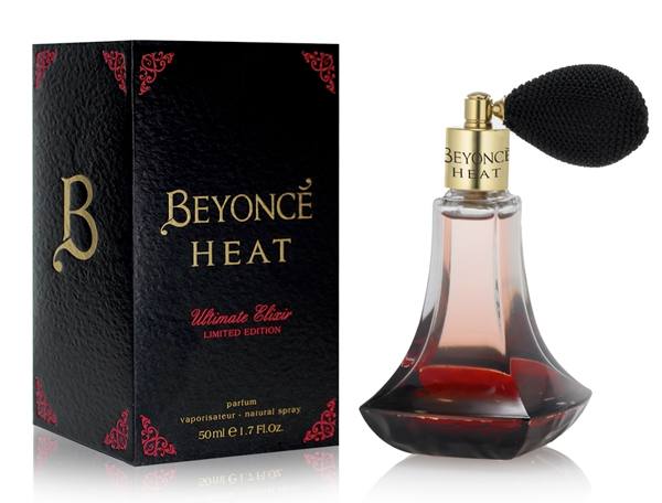
Package Design, and Bottle-

The Bottle: (A) It’s red, making you think of heat, fire, lust, and feminine essence. It has a round bottom to make you think of her “ghetto-booty-pow” she’s got going on, so I think it works for what it is aiming at.
Package: (B) I personally have never been a fan of the Magenta-Red color myself, and the gold text in my eye pops strange. It’s good for getting it’s point across, and the boarder matches the rest of the box, which I think looks better then the front.
Personally I think the promo design of the package was better-
The Video-
Now, this gets you thinking of sex, and saunas. Not quite sure how this relates to perfume? Me neither! Then of course we have Beyonce pretty naked, and at some point looks like she’s trying to get it on with the wall. The effects are cool, but the imagery is confusing, and kind of overdone. Overall I give it a (C).
So in conclusion, The whole campaign would get a (B-) Some good, some bad, but this one was totally better (and created four years ago for a college psychology class)
Much Love;
Kat
No comments:
Post a Comment